Related resources
Related tools & guides
Quick reference
| Item | Details |
|---|---|
| Checkerboard grid | Alternate two post styles every other tile (e.g., quote / photo / quote / photo). Works for any niche with two strong content pillars. |
| Row theme | Each horizontal row of three posts tells one story or covers one topic. Forces themed batches of 3. |
| Color palette grid | Every post stays within a chosen palette. Strongest visual cohesion; demanding to maintain. |
| Puzzle grid | 9 (or 6) posts combine into one large image. High-impact visual — best as a campaign launch, not a permanent layout. |
| Monochrome grid | All photos in black/white or single-tone. Easy to maintain; instantly recognizable brand signature. |
Why Your Instagram Grid Matters
Your Instagram grid is the first thing people see when they visit your profile. It takes about 0.2 seconds for someone to form an impression — and most of that comes from how your grid looks as a whole, not from any single post.
A cohesive grid signals professionalism, consistency, and brand identity. An inconsistent grid looks random and gives visitors no reason to hit Follow.
Research from Instagram marketing studies shows profiles with a consistent visual style have 30-40% higher follow rates than those without one. Your grid is essentially your visual resume.
The good news: you don't need to be a designer. You just need a pattern and the discipline to stick to it.
How to Analyze Your Current Instagram Grid
Before changing anything, audit what you already have. Open your profile and look at your last 9-12 posts as a group.
Questions to ask yourself
- Is there a dominant color? Cohesive grids usually have a consistent color palette — warm tones, muted pastels, bold contrasts, etc.
- Do the posts feel related? Or does each one look like it belongs to a different account?
- Is there variety in format? All carousels or all single images can feel monotonous. A mix of Reels, carousels, and static posts creates visual rhythm
- Are the fonts consistent? If you use text overlays, are they the same font and style across posts?
- How does it look at a glance? Zoom out or squint. Does it look intentional or chaotic?
Check your top-performing posts
Go to Insights → Content → Posts and sort by reach or engagement. Look for visual patterns in your best posts:
- What colors performed best?
- Did carousels outperform single images?
- Did posts with faces get more engagement?
- What style of cover image drove the most taps?
This tells you what your audience already responds to — build your grid strategy around that, not just what looks pretty to you.
7 Popular Instagram Grid Layout Styles
1. Checkerboard
Alternate between two types of content — for example, a quote graphic followed by a photo, repeating across the grid. This creates a clean, structured look with clear visual rhythm.
Best for: coaches, educators, personal brands, service businesses
How to do it: alternate between two templates — one text-heavy, one image-heavy — with every post. The contrast between the two formats creates the checkerboard pattern automatically.
Difficulty: Easy — just alternate two formats
2. Row-by-row
Each row of three posts follows a theme, color, or topic. One row might be product photos, the next is behind-the-scenes, the next is testimonials.
Best for: businesses, product brands, creators with diverse content types
How to do it: plan in batches of three. Publish all three posts in a row before moving to the next theme. This requires careful scheduling to avoid breaking the row.
Difficulty: Medium — requires posting in exact order
3. Column layout
Each of the three columns has a consistent content type. For example: left column is tips, middle is Reels, right is personal photos.
Best for: creators who post on a strict schedule (e.g., 3x/week, same day each time)
How to do it: assign a content category to each column position and always post in order. Monday = tips (left column), Wednesday = Reel (middle), Friday = personal (right column).
Difficulty: Medium — tied to posting schedule
4. Color-blocked
Groups of 3, 6, or 9 posts share a dominant color or filter. As you scroll, the grid shifts through color phases.
Best for: lifestyle brands, photographers, aesthetic-focused accounts
How to do it: batch-create content in color themes. Use the same preset or filter for each block. Transition smoothly between colors by overlapping one shared tone.
Difficulty: Hard — requires significant planning and batch creation
5. Consistent filter/editing style
No strict pattern — just apply the same editing style to every post. Same brightness, contrast, saturation, and color tone.
Best for: anyone. This is the easiest approach and works for every niche.
How to do it: create a preset in Lightroom Mobile or your photo editor. Apply it to every image before posting. That's it.
Difficulty: Easiest — no planning needed, just consistency in editing
6. Puzzle grid
Individual posts form a larger image when viewed together on the grid. Usually done in sets of 9 (3x3).
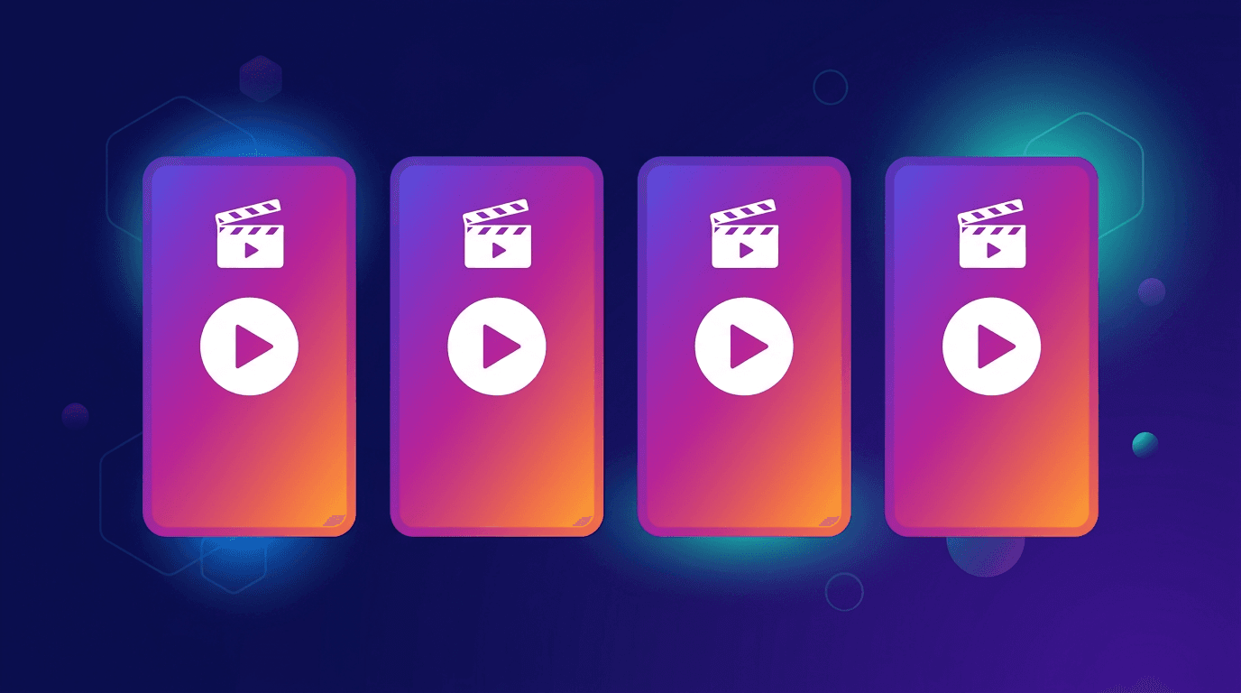
Schedule to every platform at once
PostLink lets you upload once and publish to TikTok, Instagram, YouTube, Facebook, and more simultaneously.
Best for: launches, announcements, portfolio reveals, events
How to do it: design a large image in Canva or Photoshop and split it into 9 tiles. Post them in reverse order (bottom-right first) so they assemble correctly on the grid.
Difficulty: Hardest — each post doesn't stand alone, and the pattern is disrupted by new posts
7. Borders and frames
Every post has a consistent border — white frames, rounded corners, or a signature frame color. This creates visual breathing room between posts.
Best for: photographers, artists, portfolio accounts
How to do it: add consistent borders to all images in your editing app before posting. White borders are the most common and create a gallery-like feel.
Difficulty: Easy — apply the same border template to every image
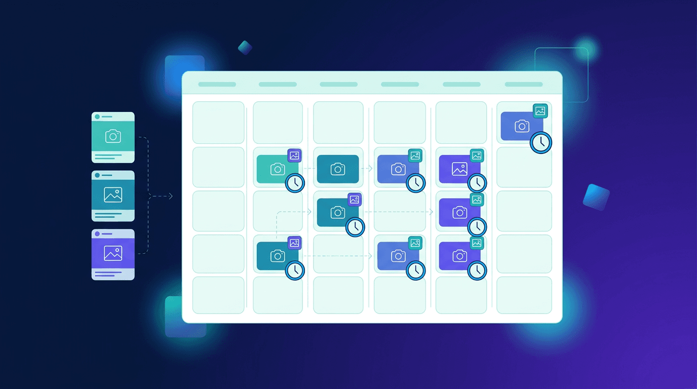
How to Plan Your Grid Before Posting
Step 1: Choose your layout style
Pick one of the styles above. If you're unsure, start with "consistent filter" — it's the most forgiving and easiest to maintain long-term.
Step 2: Define your content pillars
Choose 3-5 recurring content types. For example:
- Educational tips (carousels)
- Behind-the-scenes (photos/Reels)
- Customer testimonials (quotes)
- Product features (Reels)
- Personal/lifestyle (photos)
Having defined pillars ensures variety without randomness. Each post fits into a category, making planning easier.
Step 3: Create visual templates
Use Canva, Figma, or Adobe Express to build templates for each content type. Lock in:
- Font family — 1-2 fonts maximum
- Color palette — 3-5 colors that work together
- Layout structure — where text goes, where images go
- Logo or watermark placement — consistent position
Save these as templates you can reuse for every new post.
Step 4: Preview before you publish
Use a grid preview tool to see how upcoming posts will look alongside your existing content. This is the single most important step — it catches visual clashes before they go live.
Free grid preview tools:
| Tool | Platform | Key feature |
|---|---|---|
| Planoly | iOS, Android, Web | Visual planner with drag-and-drop grid preview |
| Preview App | iOS, Android | Free grid planner with filter previews |
| UNUM | iOS, Android | Grid layout planning with analytics |
| Canva | Web, iOS, Android | Design + grid mockup in same tool |
| Later | Web, iOS, Android | Visual planner with auto-publish |
Step 5: Schedule and publish in order
Grid planning only works if posts go out in the right sequence. If you plan a checkerboard pattern but publish out of order, the grid breaks.
Use a scheduling tool to queue posts in the exact order they should appear. PostLink's Instagram scheduler lets you schedule Instagram posts alongside TikTok, YouTube, Facebook, and other platforms — so your grid stays on track while you manage all your channels from one place.
Instagram Grid Dimensions and Sizes
| Element | Recommended size |
|---|---|
| Grid thumbnail (displayed size) | 161 × 161 px |
| Square post | 1080 × 1080 px |
| Portrait post (4:5, recommended) | 1080 × 1350 px |
| Landscape post (1.91:1) | 1080 × 566 px |
| Reel cover image | 1080 × 1920 px (9:16) |
| Carousel slide | 1080 × 1080 px or 1080 × 1350 px |
Important notes on cropping
- Portrait posts (4:5) are cropped to square in the grid view. Make sure the key visual element is centered so it looks good when cropped
- Reel covers are displayed at 9:16 in the Reels tab but cropped to a square (1:1) in the main grid. Design your Reel cover with the center safe zone in mind
- Landscape posts appear with black bars above and below in the grid — they generally look worse in the grid than square or portrait content
Pro tip: Use portrait format (1080 × 1350) for feed posts to take up more screen space, but design the content so the top 1080 × 1080 square looks complete on its own — that's what shows in the grid.
Common Grid Mistakes to Avoid
Changing your style too often
Picking a new aesthetic every month makes your grid look fragmented. Commit to a style for at least 3 months before evaluating whether to change it. Your followers need time to recognize and associate your visual style with your brand.
Ignoring Reels cover images
Reels default to a frame from the video, which often doesn't match your grid aesthetic. Always set a custom cover image that fits your grid's style.
To set a custom Reel cover:
- Before publishing a Reel, tap Cover
- Choose Add from Camera Roll to upload a designed cover image
- Adjust the crop to fit the square grid display
Overcomplicating it
A puzzle grid looks impressive but is exhausting to maintain. A consistent editing style with good content beats a complex grid pattern with mediocre content every time. Start simple and level up only when the simpler approach feels limiting.
Forgetting mobile proportions
Most people view your grid on mobile, where only 3 columns are visible and thumbnails are small. Design for mobile first:
- Don't rely on fine details or small text in grid thumbnails
- Ensure high contrast so posts are legible at small sizes
- Test by viewing your profile on your phone before publishing
Not accounting for Reels and carousels in the grid
Reels and carousels show their first frame/slide as the grid thumbnail. If you're using a grid layout style (checkerboard, columns), plan what the first frame of your Reel or first carousel slide will look like in the grid.
How to Reset Your Instagram Grid
If your current grid is a mess and you want to start fresh:
Option 1: Archive old posts
- Go to each post you want to hide
- Tap the three dots → Archive
- The post disappears from your grid but isn't deleted — you can restore it anytime
This cleans your grid without losing content. Archive posts in batches until only your best or most recent content remains.
Option 2: Delete and restart
More drastic — delete posts that don't fit your new aesthetic. Only do this if you're sure you won't want those posts back.
Option 3: Gradual transition
Keep posting new content in your updated style. Over time (9-12 posts), the top of your grid reflects the new look. This is the least disruptive approach and what most creators recommend.
Analyze and Iterate
Your grid strategy isn't set-and-forget. Review it monthly:
- Screenshot your grid at the start of each month to track visual evolution
- Check engagement data — are posts matching your grid style performing better than before?
- Look at follower growth — a cohesive grid should improve your profile-visit-to-follow conversion rate (check in Instagram Insights under "Accounts Reached → Profile Activity")
- Ask for feedback — post a Story poll asking followers what content they like most
- Compare with accounts you admire — note what visual patterns they use and how their grid feels different from yours
The goal isn't a "perfect" grid — it's a grid that looks intentional and makes new visitors want to follow.
Summary
To plan your Instagram grid layout:
- Pick a layout style — start with consistent filter/editing if you're unsure
- Define 3-5 content pillars for variety without randomness
- Create reusable templates in Canva or Figma with locked fonts, colors, and layouts
- Preview before publishing with a grid planning tool (Planoly, Preview, UNUM)
- Schedule in order so grid patterns aren't disrupted
- Always set custom Reel covers to match your grid aesthetic
- Review monthly and iterate based on engagement data
Consistency matters more than perfection. A simple editing preset applied to every post will make your grid look 10x more professional than any complex layout strategy you can't maintain.
Frequently asked questions
What is an Instagram grid layout?
An Instagram grid is the arrangement of your posts as seen on your profile page. Because posts display in rows of three, many creators plan their uploads in sets of three or nine to create a cohesive visual pattern.
How do I plan my Instagram grid before posting?
Use a grid planning tool to preview how upcoming posts will look on your profile before you publish them. Tools like Preview App, Planoly, or PostLink let you arrange and schedule posts so your grid stays consistent.
What is the best Instagram grid layout?
The best layout depends on your brand. Popular styles include the checkerboard (alternating styles), the row theme (each horizontal row tells a story), the color palette grid (consistent tones across all posts), and the puzzle grid (posts combine into one large image).
Does Instagram grid layout affect growth?
A cohesive grid improves the first impression your profile makes, which can increase follow-through rates when new visitors land on your page. It doesn't directly affect the algorithm, but it affects whether people decide to follow.